How eye tracking revealed otherwise undiscoverable usability issues on GT's Course Builder
An in-person usability study combining eye-tracking, retrospective think-aloud interviews, and SUS scoring uncovered why first-time users hesitated, misread the interface, and lost trust in Gutenberg Technology's AI-powered Course Builder, then turned those findings into concrete design recommendations.
The challenge: GT needed to see their course builder through a first-time user's eyes
Gutenberg Technology (GT) was building an AI-powered course creation tool that helps educators quickly generate course structures and content. The AI generation itself was strong, but GT didn't yet know how first-time users actually interpreted the interface, navigated the creation flow, or built confidence while using it.
- Where do users get stuck?
- Which terms or labels cause confusion?
- How well do users understand what information belongs in each section?
- Does the system give users enough feedback to build trust?
- Does the flow make sense to someone with no prior experience?
Those questions became our design question: how might we guide first-time users through an AI-powered course creation tool in a way that feels predictable, transparent, and easy to understand?
Research: triangulating eye-tracking, think-aloud, and usability scoring
To answer that question, I designed a mixed-method study that could triangulate multiple data sources: what people actually did, why they did it, and how usable they felt the system was overall.
- Eye-tracking. In-person sessions with eight first-time users, each individually calibrated, to see exactly where attention lingered, where gaze bounced between elements, and where people hesitated before acting.
- Scenario-based tasks. Participants created a foundational course for college students, then adapted it for elementary students, completing core tasks like creating a project, generating module pages, editing content, and regenerating for a new audience.
- Retrospective think-aloud. After each session, participants watched their own eye-tracking recordings back and narrated what they expected, where they got confused, and where they lost confidence.
- SUS questionnaire. A standardized ten-question survey measuring perceived usability on a 0 to 100 scale, giving us a quantitative benchmark alongside the qualitative findings.
Each session ran 45 to 60 minutes. Combining behavioral data, participant narratives, and a usability score gave us a far more complete picture than any single method could have on its own.
Users could learn the system, but they couldn't yet trust it
Across eight sessions, GT's Course Builder scored a 61.3 overall on the SUS scale, landing in the "needs improvement" range.
- Overall SUS score: 61.3, landing in the "needs improvement" range.
- Usability score: 58.6.
- Learnability score: 71.9.
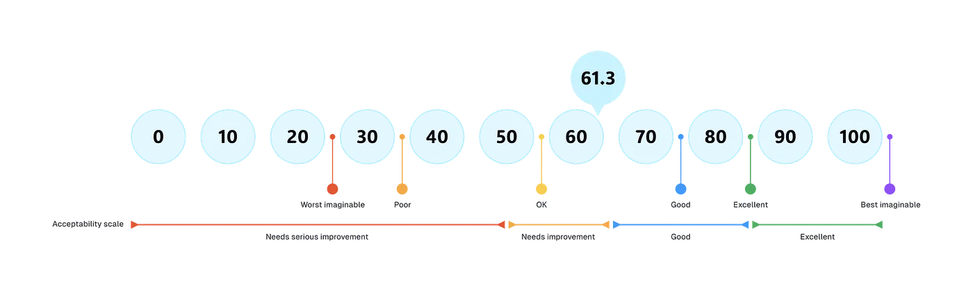
That gap between learnability and usability suggested people could pick up the basic mechanics of the tool, but still hesitated to trust or navigate it with confidence, exactly the kind of pattern eye-tracking and think-aloud data could help explain.
Five moments where users hesitated, misunderstood, or lost confidence
We synthesized our findings into three themes, unclear labeling, missing guidance, and insufficient feedback, that showed up again and again across five specific moments in the flow.
Two "New Project" buttons split users' attention
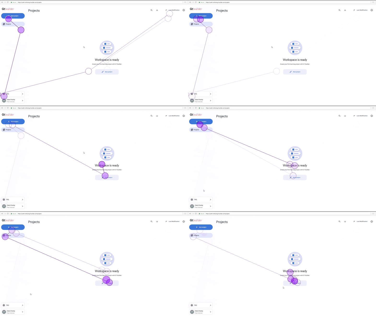
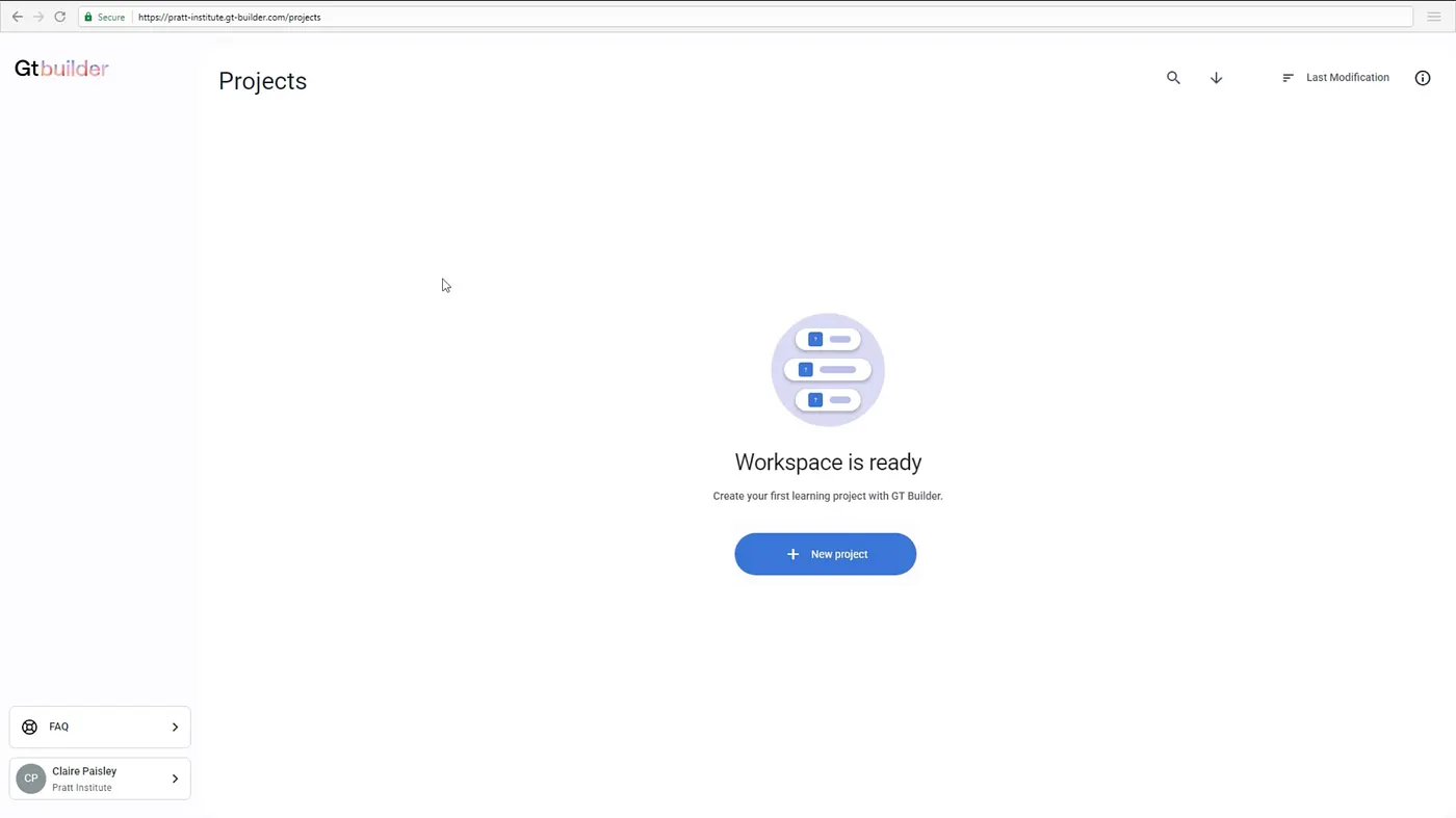
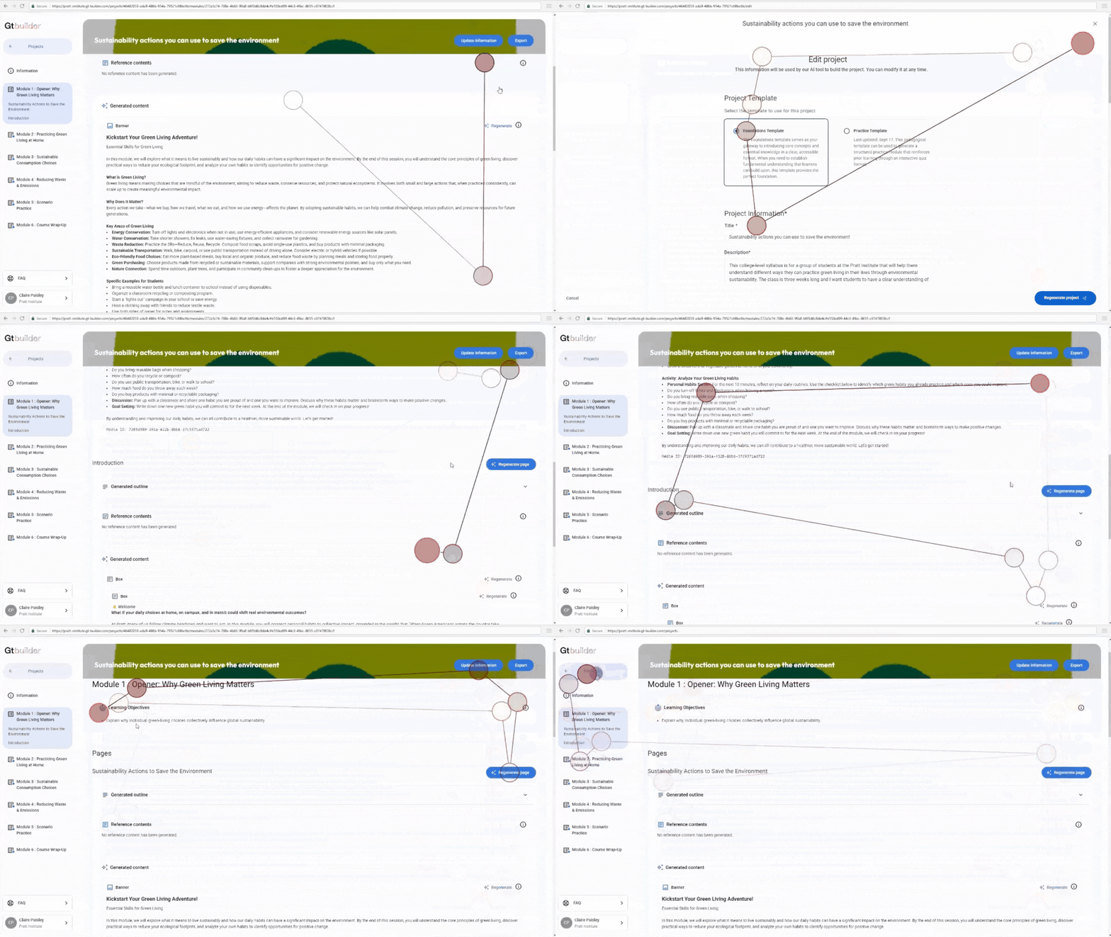
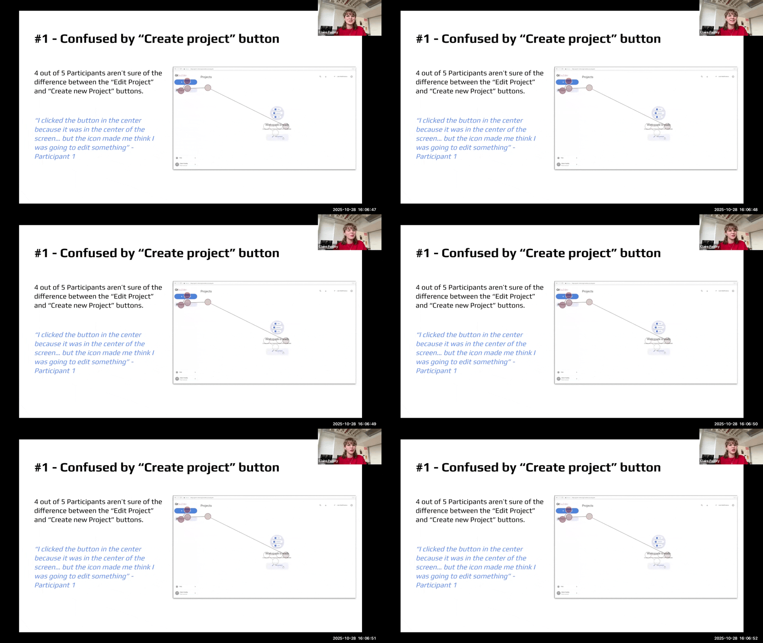
Six of eight participants debated which button actually created a new project, with eye-tracking showing their gaze jumping repeatedly between a button in the sidebar and a nearly identical one in the center of the screen. "I felt like the button in the sidebar belonged to a different category," said Participant 3. We recommended consolidating to one primary "Create New Project" button with a clear plus icon.
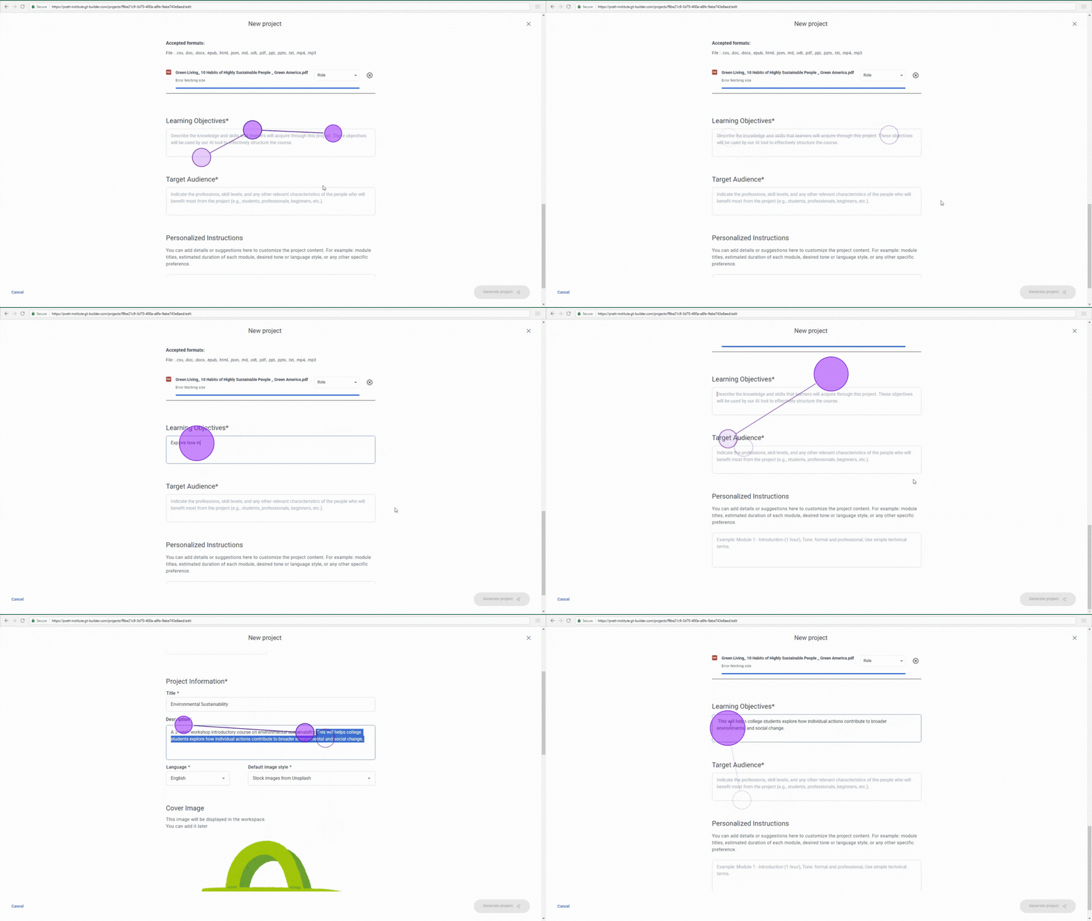
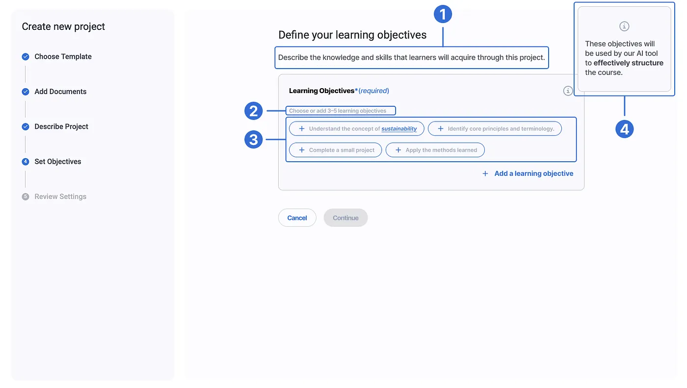
Description and Learning Objectives blurred together
Eye-tracking showed long, repeated fixations bouncing between the Description and Learning Objectives fields, and one participant admitted they weren't sure which one certain information belonged in. "I thought the objectives went in the description initially. I wasn't really sure what to put," said Participant 8. We recommended giving every field a stated purpose, length guidance, examples, and a note on how it would shape the AI's output.
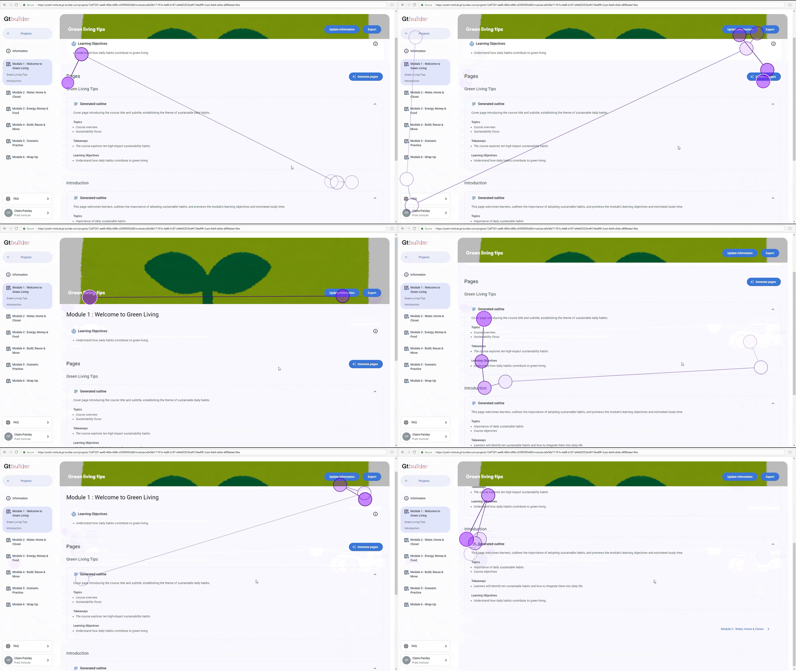
Nobody knew whether "Generate Page" would overwrite their work
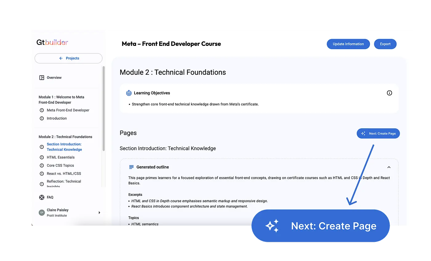
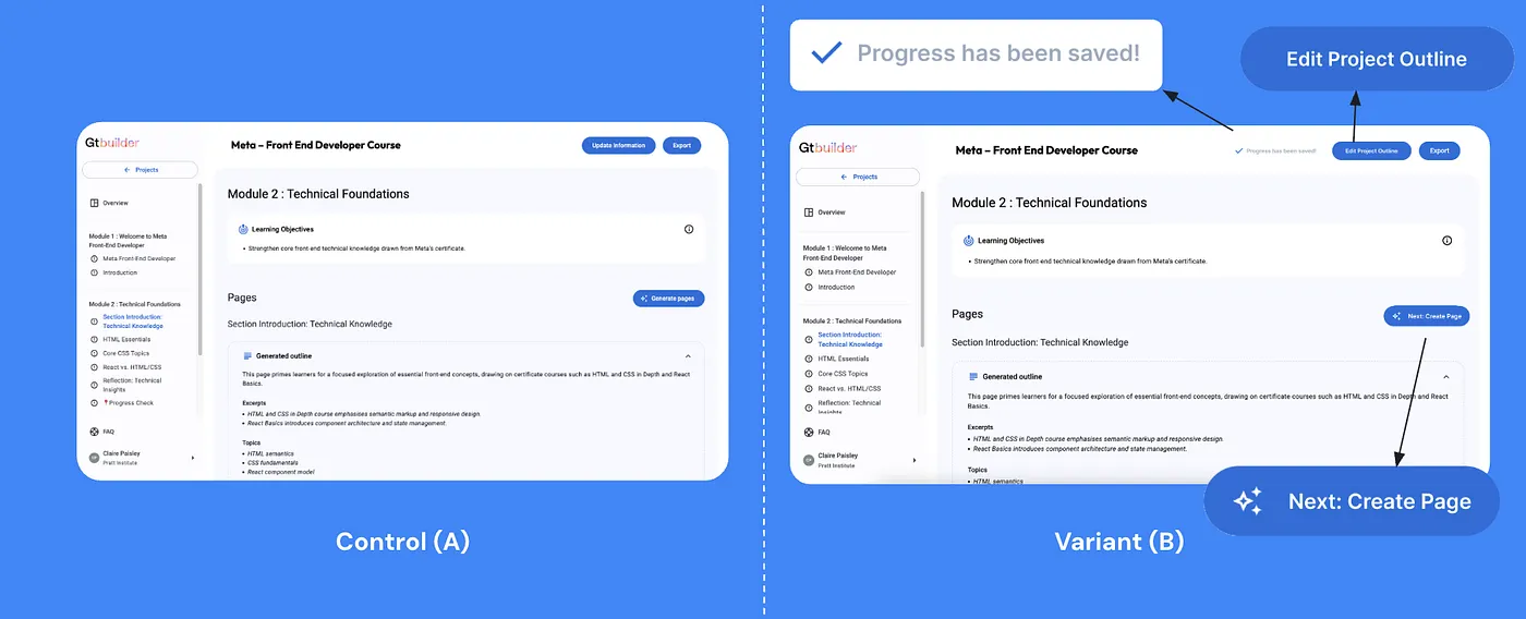
As first-time users with no existing mental model for how outlines, modules, pages, and content related to each other, participants hesitated before clicking Generate Page. "How do I edit this? Should I generate a page?" asked Participant 2. We recommended step-based transitions, like "Next: Create Page," to guide people through a flow they had never seen before.
Silence during AI generation read as the system freezing
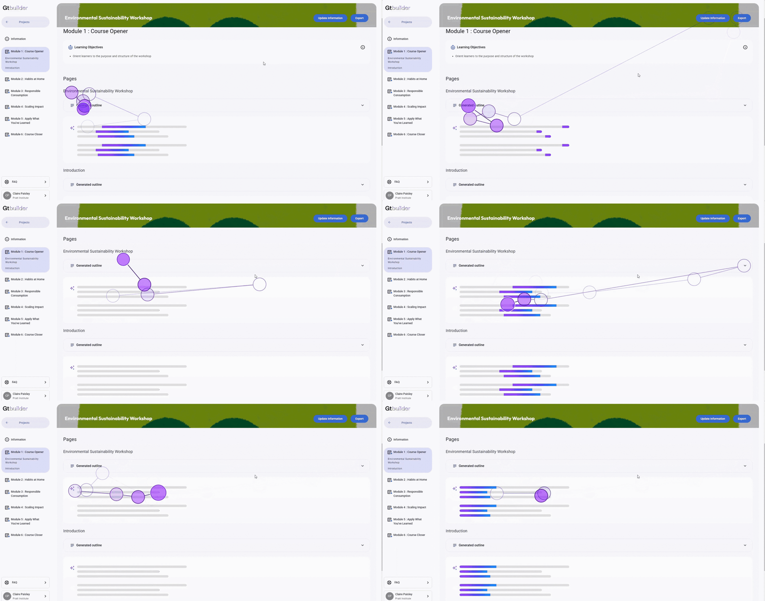
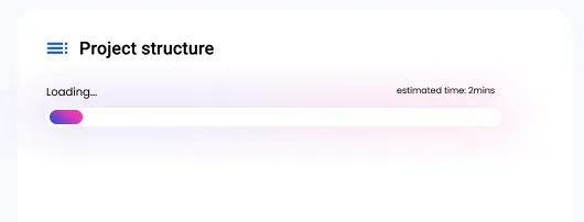
All eight participants showed signs of anxiety while a module generated, their eyes wandering across a blank screen with no indication of progress. "Is it working or frozen?" asked Participant 2. "Should I refresh?" wondered Participant 5. We recommended a loading bar with an estimated completion time and microcopy explaining what the system was doing.
Users couldn't tell if their work had actually saved
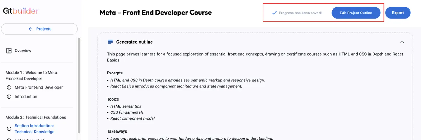
The "Update Information" button left participants unsure whether their edits had been saved at all. "I wasn't sure if the work I had just done was being saved or not, the wording was confusing to me. I was looking for some sort of save update," said Participant 6. We recommended renaming the button to "Edit Project Outline" and adding a visible save status indicator.
The pattern across all five: when the interface stayed silent, ambiguous, or inconsistent, first-time users lost confidence, even when the AI underneath was working exactly as intended.
Final delivery: presenting findings back to the client
We delivered our findings directly to Gutenberg Technology, walking through each usability theme and its corresponding recommendation over Zoom.
"This is incredibly helpful. The clarity from eye-tracking insights is something we've never seen before."
Gutenberg Technology
What's next
If this project were to continue, I would want to run an A/B test putting our recommendations to the test.
An A/B test shows two versions of a design to different user groups and compares real performance, turning our recommendations into evidence instead of assumptions. Testing the current interface against a redesigned one, with the updated button wording and the new save status indicator, would show whether those changes measurably improve user clarity and task success.
Thanks for reading!
This project was built alongside Lan-Ting, Jeffery, and Aswathi. Mixed-method research is becoming one of my strengths, and this project reaffirmed how well quantitative signals like eye-tracking and SUS scoring pair with qualitative ones like task observation and think-aloud interviews to tell a complete, actionable story. Working with a method as specialized as eye-tracking also taught me how to bring structure and clarity to a genuinely complex research environment, and it's a project I'm proud to have led.